A travelling orchestra cannot rely on one concert hall to make it familiar. Phion instead uses movement itself as the constant: its wordmark bends with each programme, while a strict typographic rule prevents expression from becoming visual drift.
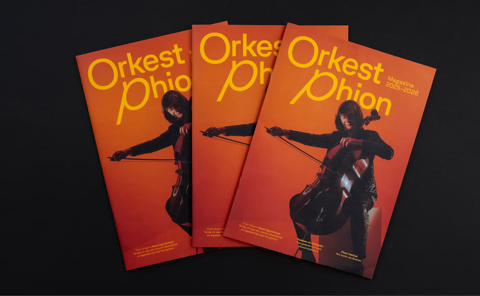
Editorial applications show how one typographic rule produces variety without losing authorship. Image: Phion Symphony Orchestra / Thonik, via BP&O.
The First Letter Conducts the Rest
GT Planar can move between reverse slant, upright, and italic forms. Thonik lets the first letter establish a direction that the rest of the title follows. A restless piece can push forms harder; a calm programme stays open and quiet.
That rule is the strategic center. Motion is not an effect added after the logo—it translates the energy and tempo of the music into a repeatable decision.
Consistency Can Be a Method, Not a Frozen Shape
Phion broadens the usual idea of a logo system. Recognition comes from typeface, scale, motion logic, and image relationship rather than one locked arrangement.
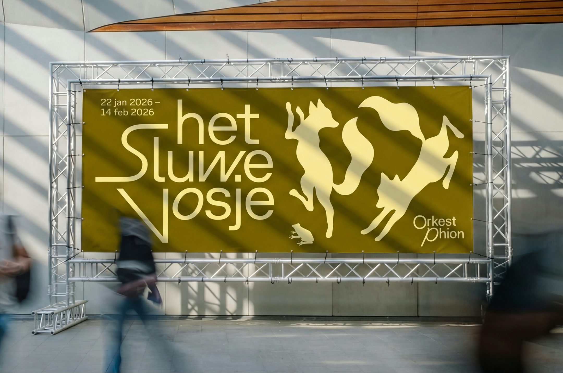
Campaign typography takes its color and movement cues from each performance image. Image: Phion Symphony Orchestra / Thonik, via BP&O.
Color also follows a rule: typography draws from the dominant tone of each performance image. Campaigns can change dramatically and still feel composed by the same hand.
A Useful Constraint for Smaller Cultural Brands
- Name the emotional variable the identity should express.
- Choose one controllable axis—slant, width, weight, or spacing.
- Write a rule for when that axis changes.
- Test the quietest and loudest versions side by side.
Source: BP&O review with Phion / Thonik imagery. Images are credited to Phion Symphony Orchestra and Thonik via BP&O.
MIT Media Lab’s responsive identity and De Bijloke’s sound-shaped mark offer useful contrasts: both vary through a recognizable grammar, but Phion ties each typographic decision directly to a performance’s emotional movement.
Give variation a conductor. Open Sologo’s wordmark maker, choose one controllable typographic axis, and test its quiet and energetic limits.