Kerry Dairy Ireland did not begin its next chapter by polishing an old badge. It chose a new name—Kinisla—and made naming, ownership, landscape, and global ambition solve the same problem. That makes this more useful than a conventional before-and-after logo story.
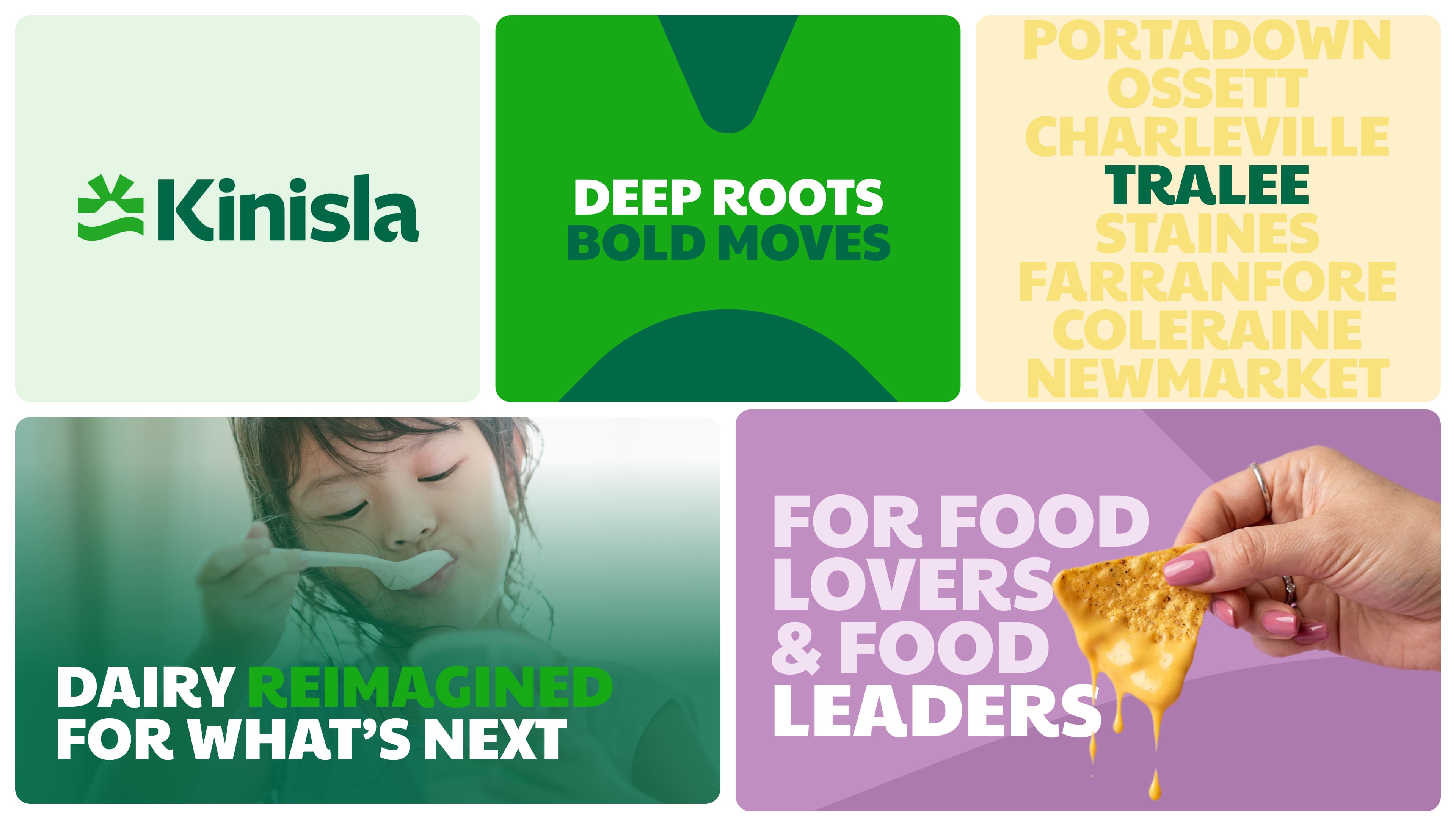
The asset family connects landscape-derived color, typography, and the new symbol. Image: RichardsDee official case study.
The Name Carries the Strategy Before the Logo Arrives
“Kin” signals collective ownership and shared progress. “Isla” evokes island resilience and an outward-looking Atlantic identity. Together they create a pronounceable corporate name that can travel beyond Ireland while retaining an emotional link to the cooperative communities behind the business.
This is why naming should not be treated as a label applied after positioning. A strong name compresses the business model and ambition into a memorable sound; the visual identity can then reveal those meanings instead of inventing a disconnected metaphor.
One Symbol Holds Coast, Land, Light, and a Hidden K
RichardsDee's mark uses a wave for coastal origin, negative space for landforms, upward rays for optimism, and a subtle K for Kerry. The useful lesson is not to pack four stories into every logo. It is to make several verified truths converge on one economical form.
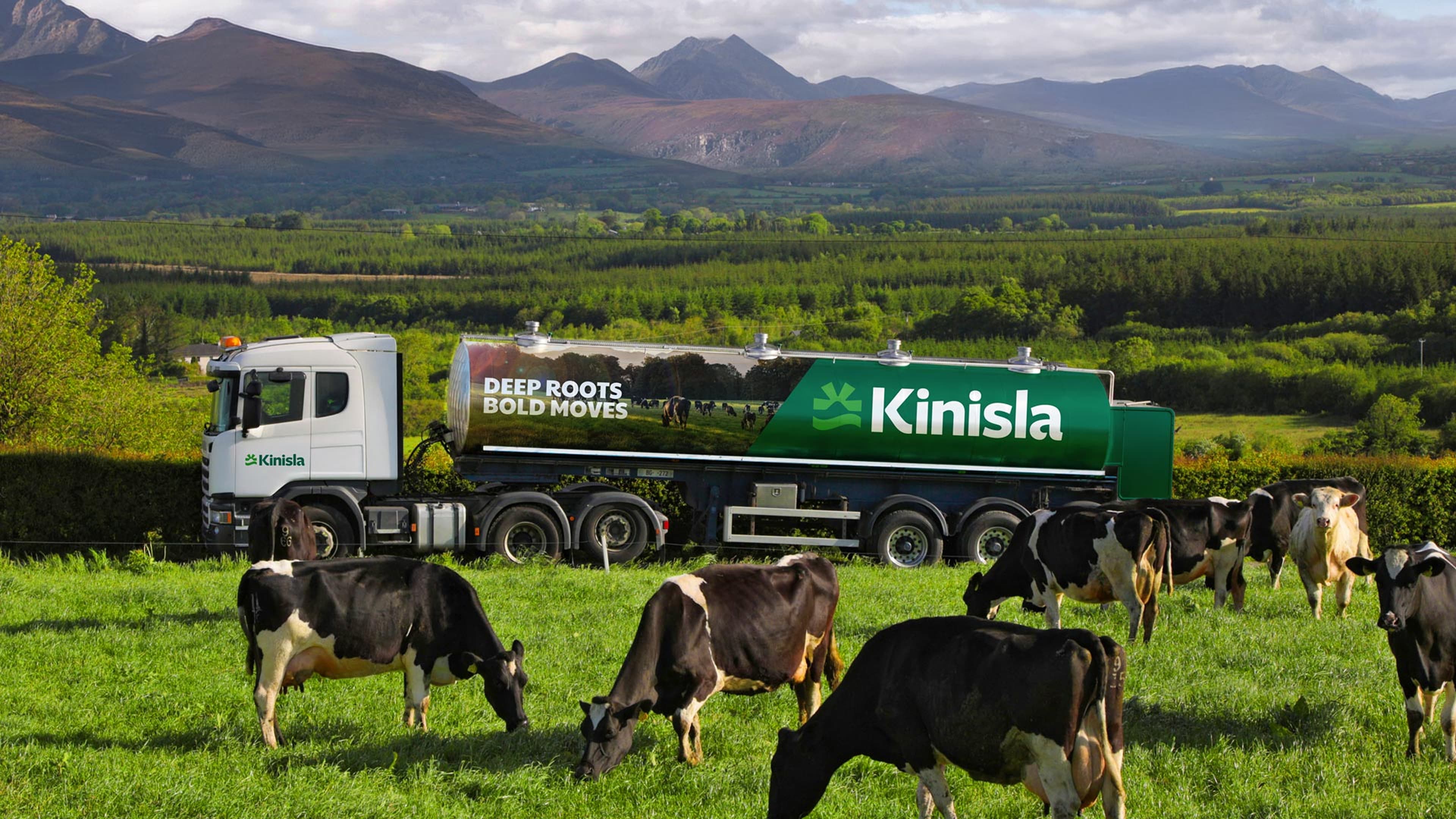
The identity has to stay legible and distinctive at the scale of an operational milk tanker. Image: RichardsDee official case study.
The milk tanker is the real test. On a moving industrial surface, the mark must read faster than the strategic explanation. That is where the broader brand identity earns its keep: color, type, photography, and verbal tone carry nuance while the logo stays simple.
Heritage Brands Need Two Speeds
Slow signals build trust
Pasture greens, earthy neutrals, dairy whites, and documentary imagery connect Kinisla to land, farmers, and continuity.
Fast signals create momentum
A brighter secondary palette, laboratory imagery, and sharper applications communicate innovation, nutrition, and international scale. Neither speed works alone: heritage without momentum feels local and static; innovation without roots feels interchangeable.
A Practical Brand-Family Lesson
Smaller food and agricultural businesses should list the audiences and environments their identity must serve before choosing a symbol: producers, trade buyers, consumers, recruitment, vehicles, packaging, and digital products. Shared rules matter more than making every application look identical.
Source: RichardsDee official Kinisla case study. Related tools include Sologo's name-to-logo maker, brand kit generator, and AI mockup tool.
Build the system around your own roots and future. Open the matching Sologo tool and turn your own brand idea into an original direction.