The lettering that makes a financial brand recognisable on a billboard should not demand the same attention beside an account figure. Pentagram’s SMCC project, featured in its September 25, 2026 news, is an instructive case of designing for both situations.
For Sumitomo Mitsui Card Company, the team developed a Latin-script type family and wordmark system. This is a typography project within the company’s brand update—not an announcement that the wider SMBC group has replaced its logo. Its most useful lesson is about how much personality different reading tasks can carry.
Start with the smallest label
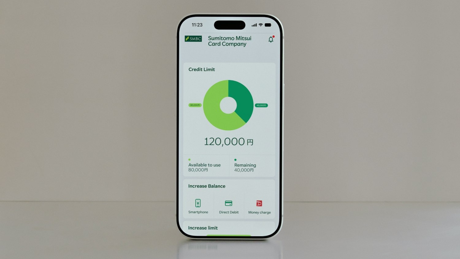
SMCC interface presentation from Pentagram: small labels and numerical information create a different reading task from a billboard. Source
A screen full of figures asks the reader to compare, check and act. In that setting, letterforms are doing a service job. A distinctive terminal that looks appealing in a headline may be less helpful when it makes two small characters harder to tell apart. The relevant test is whether the reader can distinguish the information, not whether every line looks equally branded.
Pentagram describes separate Headline and Text styles, with the text design moderating some expressive features. The family also includes a special logo weight. This gives identity designers a useful model: keep the relationship between styles, while allowing each to do a different job. The supplied interface image is evidence of the design direction, not a usability study.
Why the big letters can take more risk
At display sizes, small differences in stroke and shape become visible without competing with dense information. The SMCC lettering carries a subtle forward movement. Across a large headline, that rhythm can create energy without requiring an extra decorative graphic.
A wordmark has another advantage: it makes the name itself the identifiable object. For founders comparing symbols and lettering, that can reduce the number of things an unfamiliar audience must learn. It does not remove the need to check how the name reads, particularly with unusual spelling. Sologo’s Wordmark Maker can help explore that initial choice before committing to a full identity.
Two writing systems need a shared pace
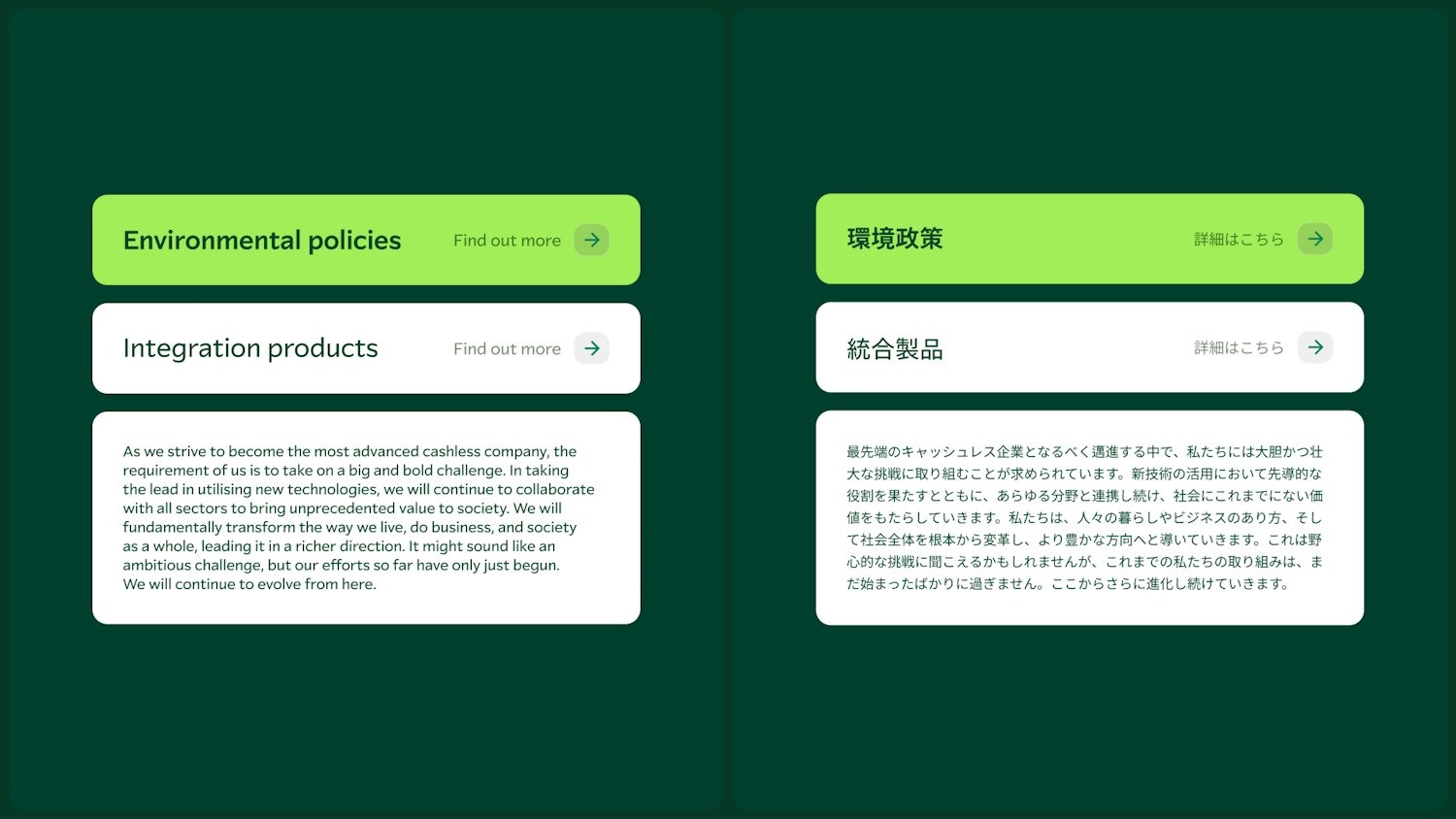
Pentagram’s side-by-side Latin and Japanese applications show a coordinated reading hierarchy. Source: SMCC / Pentagram. Source
The Latin design was developed to sit alongside the Japanese typeface Tazugane Gothic. In the agency’s paired application, hierarchy matters as much as matching shapes: headings, buttons and body text need comparable emphasis even when the scripts occupy space differently.
That point travels well beyond Japanese finance. A bilingual restaurant menu, a product label or an international consultancy website can look disjointed even when both fonts are attractive. Compare the apparent weight and reading density of equivalent messages. Copying point sizes from one language to another is only a starting point.
A useful comparison is a system, not another bank logo
Consider the different roles of Google’s wordmark and the typography inside a search result, or IBM’s striped mark and a page of product documentation. A brand can remain coherent without making its logo treatment the default appearance of every sentence. Those familiar cases clarify the distinction; they do not establish that the companies use SMCC’s approach.
For a smaller firm, the affordable version is a short type hierarchy: one treatment for the name, one for headlines, and a quiet, legible text face. Check the numerals, punctuation and every language you actually publish. Keep a few real layouts as examples in your brand kit so future materials follow the same decisions.
Begin with the name customers need to remember. Use Sologo’s Name to Logo Maker to explore its visual character, then test whether the surrounding text gives that character enough breathing room.
Source and images: Pentagram’s SMCC case study; the project appeared in Pentagram news on September 25. Reading-task analysis is our interpretation, not a reported accessibility certification.